Noticing Turquoise
At different times in life, different colors seem to speak to us. Sometimes we notice it immediately and at other times we only realize it in retrospect.
In 2011, I wrote a blog entitled “Trend Blue”. I showed how Blue, representing communication, was making itself heard in various areas of daily life as the newly acquired voice of the collective, aided by technology and most importantly the rise of social media.
During the past two weeks, I have been working on a piece entitled “Yellow Notice”. The reasons for the title could fill another blog post. I mention it because despite its title, its main color is turquoise.

Summer fashions for 2014 are being dominated by the color turquoise. As the color trends, luxury fashion brands are even bringing out handbags and shoes in this color.
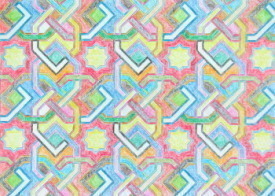
Turquoise is also currently trending in home decor and design. I discovered that especially popular is a combination of turquoise and yellow mixed with gray! Said to be daring it apparently nevertheless works. The boldness of the turquoise and yellow is neutralized by the gray.
In color psychology, turquoise is said to open the lines of communication between the heart and the spoken word. It encourages inner healing as it is said to enhance empathy and caring. The color of the evolved soul, it is believed to heighten intuition and encourage spiritual growth.
In our interconnected world, these qualities are needed as we learn to embrace and acknowledge our differences, as at the same time we find our sameness. Online, in here2here space, mindful use of technology has become imperative.
The word “turquoise” dates back to the 16th century. It is derived from an old French word meaning “Turkish”, because the mineral was first brought to Europe from Turkey, from mines in a province of Iran. In Iranian architecture, domes of palaces were covered with turquoise. Its intense color symbolized heaven on earth.
The people of Turkey used the color as decoration in many of their buildings by using turquoise ceramic glazed tiles. The color is often found in Islamic art and architecture.
While in Dubai this past week, I wandered around the creek (see gallery), exploring streets I had not visited before. It was early morning and I felt surrounded by raw life as I watched pedestrians buying freshly baked bread from little sidewalk shops and groups of friends drinking tea together in the souks.
I reached the Imam Hussein Iranian mosque on Ali Bin Abi Taleb Street and stood for a while admiring its doors and beautiful mosaic tiles. As I rounded a corner I noticed a young man sitting in front of one of its doors. There was a look on his face which caught my attention. On an impulse, I asked him if I might photograph him. He nodded.
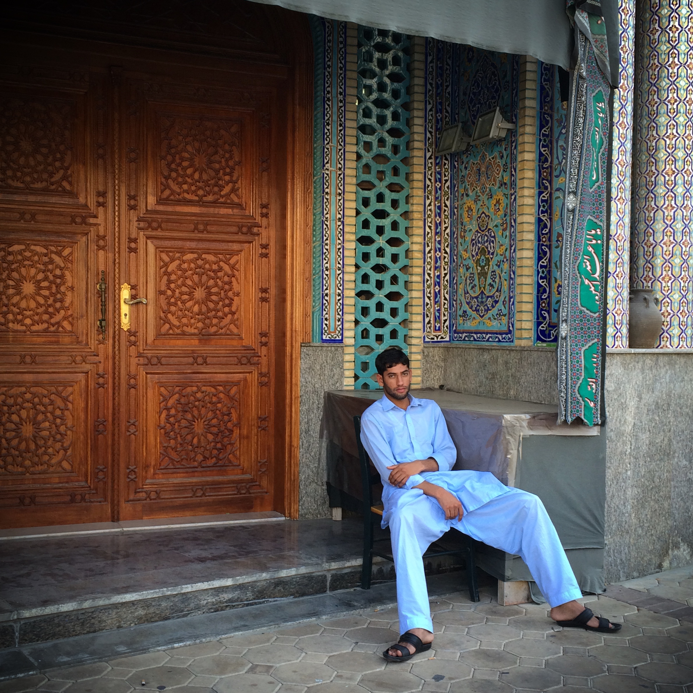
Only after posting the image on instagram, did I realize that the colors turquoise and yellow were prominently there.
Further research into turquoise revealed that the southwest United States is also a significant source of this opaque blue-to-green mineral. New Mexico is said to have some of the oldest mines. Wandering down the corridors of cyberspace, I came across a lovely blog post with this passage: (I allow it to speak for itself)
“Turquoise represents stone of sky, stone of water, stone of blessings, good fortune, protection, good health and long life. To the Native Americans, turquoise is life. There are turquoise stones medicine men keep in their sacred bundles because they possess powers of healing. Turquoise is known for its positive healing energy, an aid in mental functions, communications and expression and as a protector.
If by looking for turquoise, I see more turquoise, I wonder what would happen if I begin to be more aware of other people's acts of kindness and courage and gratitude? I am sure these acts are already there. I would hope that by looking for them, I will see more of these acts of kindness and courage and gratitude. I will start looking for them and celebrate them with a deeper awareness and appreciation.”
 Art, compassion, culture, here2here, interconnectedness, mindfulness, technology Email Article